TOLIA — The Optimus Literacy Institute of America
TOLIA
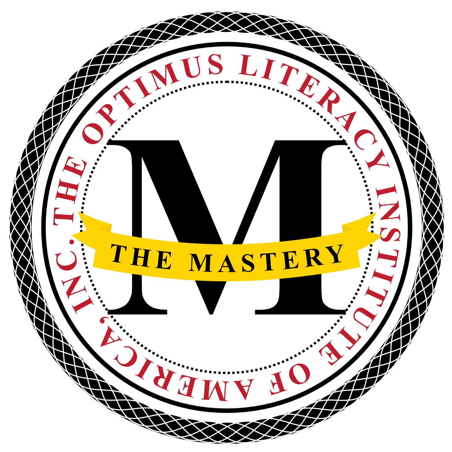
A Unified Brand System for Literacy, Learning & Academic Confidence
TOLIA — The Optimus Literacy Institute of America
TOLIA
A Unified Brand System for Literacy, Learning & Academic Confidence
Website Showcase
Project Overview
The Optimus Literacy Institute of America came with a complex brand challenge. The organization had around five different logos that needed to be recreated, modernized, and brought together under one roof. My role was to build a modern identity system that could unify the organization while still allowing each individual program to maintain its own recognizable presence.
Brand System & Program Identities
The Challenge
The real challenge here was not simply making the brand look better. It was creating something universal enough to hold several programs together while still giving each one its own identity. When an organization has multiple logos and sub-brands, things can start to feel fragmented fast. This brand needed structure, elegance, and a system that could signal high standards while still feeling warm, educational, and accessible.
Creative Direction
I wanted the brand to feel refined, academic, and aspirational. The design language was built around elegance, with a palette centered on compatible yellows, white, and black. The brand was designed to be highly photographic, using both photography and videography as core storytelling tools. Visually, I leaned into a collegiate and academic tone that positioned the institute as a place of learning, structure, and upward movement.
Outcome
The final result was a unified and elevated brand identity that gave the Optimus Literacy Institute of America a more professional and cohesive visual presence. It transformed a fragmented collection of logos into a stronger brand system with academic character, visual consistency, and room for multiple programs to operate clearly under one umbrella.
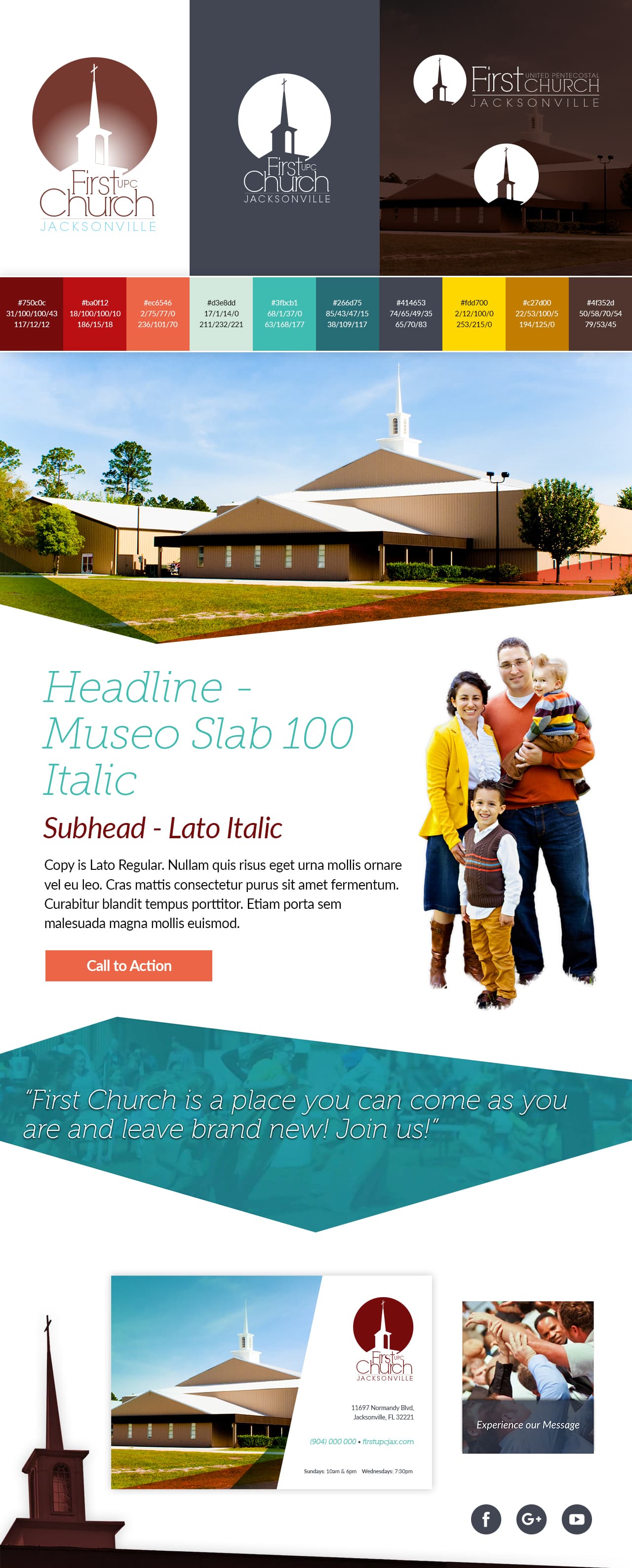
First United Pentecostal Church of Jacksonville
Brand & Website Design
Some of the most important design work doesn't start polished — it evolves. This project became an early example of how pushing past standard layouts and leaning into meaning, symbolism, and experimentation can shape a brand that lasts for decades.View Project
