First United Pentecostal Church of Jacksonville
First Church Jax
Brand & Website Design
First United Pentecostal Church of Jacksonville
First Church Jax
Brand & Website Design
Website Showcase
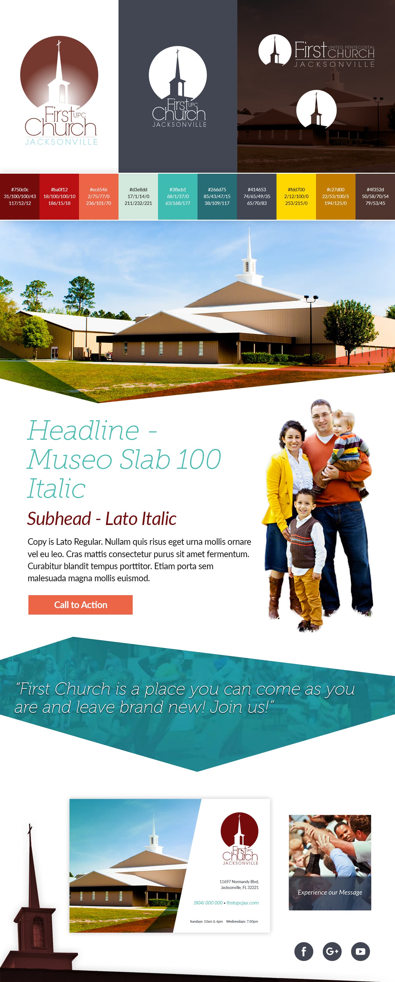
Identity & Perspective
This was one of my first church website design projects, and at the time, I was still defining my own approach to digital design. I wasn't interested in repeating what I was seeing everywhere else. I wanted to explore what a church brand could feel like if it stepped outside of the typical structure and leaned more into expression and identity.
The Industry Problem
Most church websites followed a very predictable pattern — boxed layouts, standard sections, and a rigid structure that didn't leave much room for personality. Everything was built on rectangles and grids, which made many of them feel interchangeable, regardless of the church's actual culture or community. There wasn't much emphasis on storytelling through design, or on creating a visual language that reflected the spirit of the church itself.
The Creative Obstacle
For this project, I made a deliberate decision to move away from those conventions. That introduced its own challenges. Designing without relying on standard layout structures meant I had to rethink everything — from composition to responsiveness to how content would flow across the site. Instead of blocks, the design used SVG shapes and angled polygons, often layered with subtle blurs to create depth and motion. It required more intention in every decision, because there wasn't a template to fall back on.
Brand Identity
Brand Bumper
The Turning Point
The defining moment for the brand came from something simple and personal. The logo was created from a photograph I had taken of the church's steeple years earlier. Instead of designing a symbol from scratch, I used that real-world image as the foundation, turning it into a cutout mark that directly tied the brand back to the physical church. Another key decision came from a conversation with the pastor, who emphasized the desire for the church to be known as "First Church." That insight shaped the typography, leading to a type treatment that subtly highlights "First Church" within the full name.
The Takeaway
Looking back, this project represents an early commitment to designing with intention rather than defaulting to convention. It showed me that even in structured spaces like church websites, there's room to create something distinct — something that reflects identity, culture, and meaning. The brand has now existed for nearly 20 years, and it's continued to evolve over time. That longevity speaks less to any single design decision and more to the foundation it was built on: authenticity, flexibility, and a willingness to break the mold when it matters.
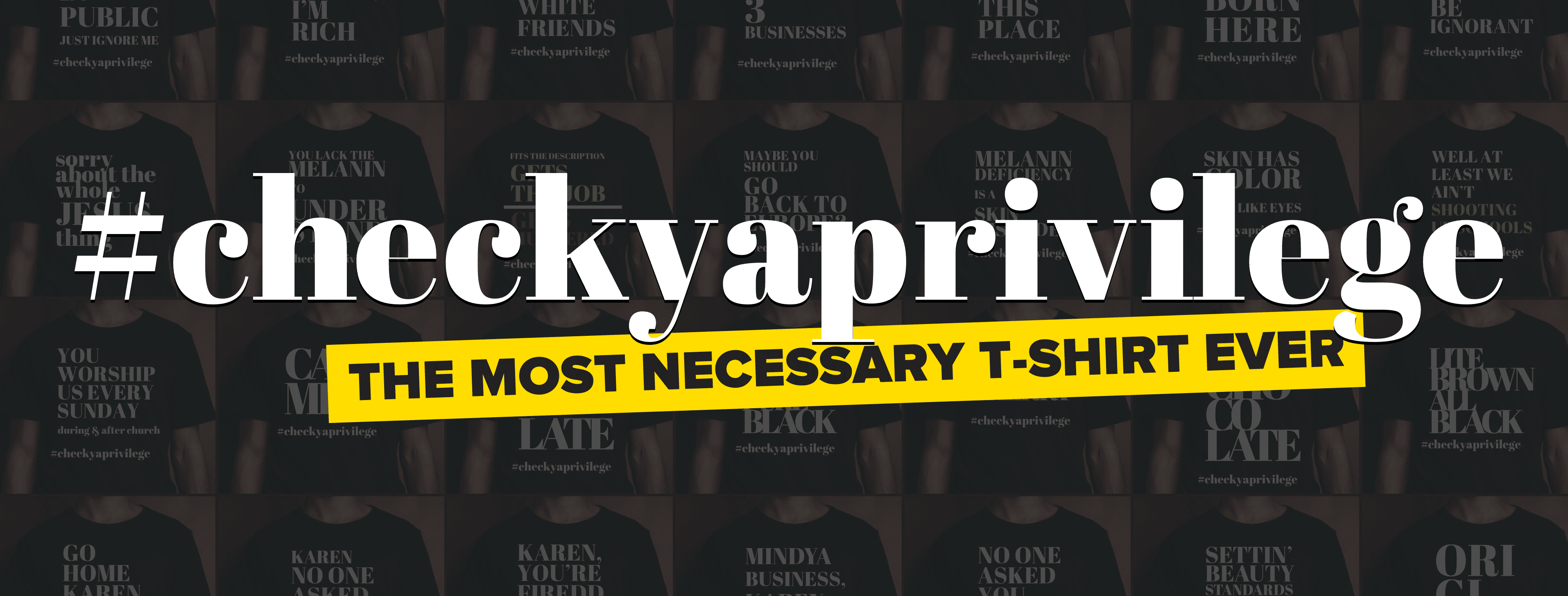
Check Your Privilege
Brand Identity, Apparel Design, Website Direction, Photography & Product Production
Check Your Privilege was an apparel brand I built from the ground up as both a visual statement and a product business. What made it meaningful was not just the look of it, but the fact that it functioned as a real business for several years.View Project
